


In Qt 4.2 trolls did amazing job at improving dockwidgets. They even added the tabbing feature so that you can group docks into the one tabwidget by just dragging one on top of another.
A couple of months ago I thought that would replace "Ideal buttonbars" - those groups of buttons you can see in KDevelop and Quanta in Ideal UI mode at the window borders. But today I think that buttons should still stay if we want the Ideal mode like we had before. We just don't have enough control of those new tabs and can't make them do what we want (i.e. hide toolviews). Also they seem to be always horizontal which is a pity because we got used to vertical rows of buttons.
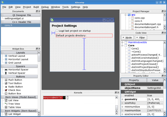
So, this and this is how KDevelop4 with toolviews looks now. Notice that KDevelop4 looks exactly like Qt Designer - all toolviews are just plain dock widgets. And this is how Ideal mode looked before. Notice the "button bars" at the bottom, left and right window sides.
The question now is Qt Designer-like interface good enough or is it better to back to good old Ideal UI with buttonbars? I don't have the good answer, please share your opinion with us at kdevelop-devel@kdevelop.org or just leave a comment here.
For now I'll continue working on new Ideal library. I miss Ideal too much ;)



Subscribe to:
Post Comments (Atom)
5 comments:
Hi,
Is there a possibility for an option, so that the user can choose which mode to use?
I guess I prefer the IDEAL mode, but sometimes it would be nice to switch to the Designer look (for example for a small project).
Regix
Personally I like the new 'Qt designe 4' look. Also it's an advantage (IMHO) that is resembles the interface of VisualStudio.
Regards Harry
There are two problems with button bars
1) Buttons represent a different language, one which the user must learn. The only way to learn the language is by hovering over every individual button and waiting for the tooltip, which is quite hard. When you add to the fact that KDevelop's Ideal move had something like 65 buttons on display, learning what each button signified was hard
2) Related to (1) above, it is extremely hard to come up with unique meaningful icons for 65 actions, and by and large, people have failed. By far and away the worst example are the 4th and 3rd last buttons on the toolbar: they have the same icon, but different behaviour. How on earth is the user meant to figure that one out?
Bascially, what I'm saying is that text is easier on users than icons, and so any approach which favours text over icons is to be preferred. If you look at NetBeans 5.0 (one of the nicest IDEs I've worked with in a while), they keep the amount of icons to an absolute minimum, going so far as to embed toolbars in panels (such as the text-editor) so that the buttons on display change when the activity the user engages in changes.
-- Bryan
Hi,
I prefer the IDEAL mode.
From an aesthetic standpoint, the qt4-designer look is vastly superior. Don't use cluttered icons again!
Post a Comment